Multi-layered design
The Paris 2024 Olympic Games Organisers on 21 October 2019 released the emblem and logo for the 2024 Paris Olympic Games.
Paris 2024 logo
This logo design is on three levels. It combines three different images in one - the gold medal, the Olympic flame, and Marianne, the official symbol of the French Republic.
“Using a human face as our symbol is intended to convey that these Games are for the people, by the people. It reflects the universal values of sport, liberty and equality.”
The Games Organisers will be releasing more of the Paris 2024 design system, team logos, and uniforms.
“By associating three iconic symbols – Marianne, the Olympic flame and a gold medal – the Paris 2024 emblem elegantly reflects the people-focused, fraternal Games France intends to host. And because the Olympic and Paralympic Games form two sides of the same coin, in 2024 they will share the same emblem for the first time ever, symbolising the pursuit of the same vision and the same ambition for both events.”
As a designer I love to inspect professional design systems. The Paris 2024 Design System is a pleasure to read and to view.
“We believe this logo captures the essence of Paris as a forward-thinking, modern capital city that is also proud to celebrate its rich culture and heritage.”
In conclusion, this design is an incredible work of art. Above all, to deliver so clearly on three different levels, with a design in itself that is modern, Parisian, feminine, and powerful.
Rethinking the exit we will all make
Design is such a powerful tool that when it is used well, can be life-changing. My Godfather is a funeral director and has been for many decades, so this article on rethinking and redesigning death and funerals had a great resonance with me.
Change is ever-present. If we want to affect the outcome of a process using design, we need to approach it from all angles. Sometimes we need to rethink the entire process from top to bottom, and inside out. Creative Review has a great article about rethinking a process that we all encounter, that of funerals - Exit Here: The Future of Funeral Planning?
While the core elements of a funeral remain the same: collecting a body; preparing it for burial or cremation; and the conduct of a ceremony. By being willing to reconsider how the funeral industry approaches its core service, Exit Here has used design thinking to reimagine the customer journey and experience.
There was also a conscious decision to “all but eliminate black from the funeral world”, … opting for a neutral but more cheerful blue instead.
Ben Masterton-Smith, Director at Transit Studio

Without changing the function of a funeral parlour, but by changing the visual appearance of a funeral parlour, subsequently changes the experience from the start. Similarly, looking at how you can change other pieces of the user journey, such as bright yellow coffins and modern blue urns help to shift focus. By including options such as the choice of being buried on a farm the design team have, in short, reimagined funerals. We are all different, and no two funerals should be the same.
“You want to leave people with a positive memory of your life. You want people to think, ‘that’s the person I knew and loved’ – and I think we need to try and change the compass on how people see the culmination of their life. Of course, no-one wants to die, but we’re all going to – we know it’s coming – so let’s make it a more joyous affair, particularly for the people left behind.”
Oliver Peyton, Exit Here
This is an excellent example of rethinking the approach to a problem and improving the experience for those involved. What could you reimagine by changing your approach?
Photo by Kerri Shaver on Unsplash
What's your role at work?
The IDEO blog had a great post today about physical office design. Well, it claims to be about office design but it’s not.
It zigs and then zags through office design, fit-out specifications, interior design, communities, collaboration, and the hidden roles that we, and our colleagues, play. Some of these roles are often not recognised until those who played them are gone. If we can identify and remember these roles, they could be built upon to improve results.
“... I think about all the potential we can unlock by holding the cultural and emotional components of work alongside legacy approaches to productivity and architecture. Our challenge—and our interest—is weaving those parts into a greater whole.”
I believe we live in an era where it is important to improve our connection to our communities and those around us. I think that this post from IDEO is one of the best I’ve read in a while.
What Comes After Open Offices? It Doesn’t Matter, As Long As Culture Comes First
Photo by Brooke Cagle on Unsplash
Using design to fix a structural issue impacting civil society
The social scientist in me loves the passion with how Mark Wilson opens his article using design in favour of vaccination.

The social scientist in me loves the passion with how Mark Wilson opens his article using design in favour of vaccination.
Let the anti-propaganda campaign begin!
Mark Wilson
This is a great article in Fast Company around using design to produce a change in perception around vaccination. The problem around vaccination is not confined to America alone. Vaccination rates are decreasing in the United Kingdom and other parts of Europe such as Italy. A good read, with real-world images to communicate messaging around vaccination.
The misinformation behind the anti-vaxxer movement has gone far enough. The United States is on the precipice of a major measles resurgence because of pseudoscientific propaganda. We need more resources that truthfully and clearly communicate the science from the CDC and WHO that proves that vaccines are safe—and you should have your children vaccinated for everything from the flu to polio.
Mark Wilson
What else could we achieve by rethinking how we use images to tell a story?
Introducing the 2019 Adobe Creative Residents
Adobe have recently announced the designers who will take part in the 2019 Creative Residency.
The designer and project that I'm most interested in following is that of Patricia Reiners. Patricia is a Berlin-based UX/UI designer exploring the city of the future and how new technologies like AI, voice control, and augmented reality will change our interfaces and design decisions.
Post-residency, she’d like to work with companies that share her passions for problem-solving and using new technologies to benefit society. You can see some of Patricia’s past work here.
How to Promote Yourself Online When You’re a Total Introvert - Adobe 99U
The design world seems to favour those who develop a strong presence on social media. But what happens when you’re an introverted designer who naturally shies away from self-promotion?
I am an introvert who knows how to be an extrovert. I have done this for so long, so well, that many of my friends, team, and colleagues find it hard to believe. But to recharge, I must have time alone to think, process, and restore.
In Susan Cain’s book, Quiet, I was introduced to ambiverts and ambiversion. An ambivert can show the qualities of both introversion and extroversion, and they can switch to either depending on their mood, context, and goals. Perhaps I am an ambivert?
Being able to switch to extroversion when I need to is a tool I use to get things done and achieve things I don’t know how to accomplish as an introvert. Sometimes the only cost to this for me is feeling drained of energy by being in ‘extrovert mode’. Other times, as well as the drain on my energy, there can also be ‘butterflies’ or nervousness about doing something outside my natural comfort zone.
Adobe’s 99U has a good article about How to Promote Yourself Online When You’re a Total Introvert. They recommend that you carefully choose the platforms you’re active on, seek meaningful interactions, and outline a way to approach social media that is useful for who you are. Well worth a read for those who are not natural extroverts online.
Straightforward colour theory for non-designers
I am slightly biased because of my experience, but I think this infographic from Micah Bowers does a great job to help non-designers improve their decision making when working with colour.
Thankfully, mastery of color in UI and UX design isn’t dependent on guesswork, blind luck, or some intrinsic realization of what colors work well together. Instead, using color successfully depends on understanding repeatable rules, principles, and techniques that can be practiced and improved upon.
And while it’s true that the study of color is an immense undertaking, there are practical takeaways that can drastically improve a designer’s understanding and use of color in day to day design work.Micah Blowers, Toptal
Colour Theory for Designers — A Crash Course (with Infographic)

Infographic by Toptal
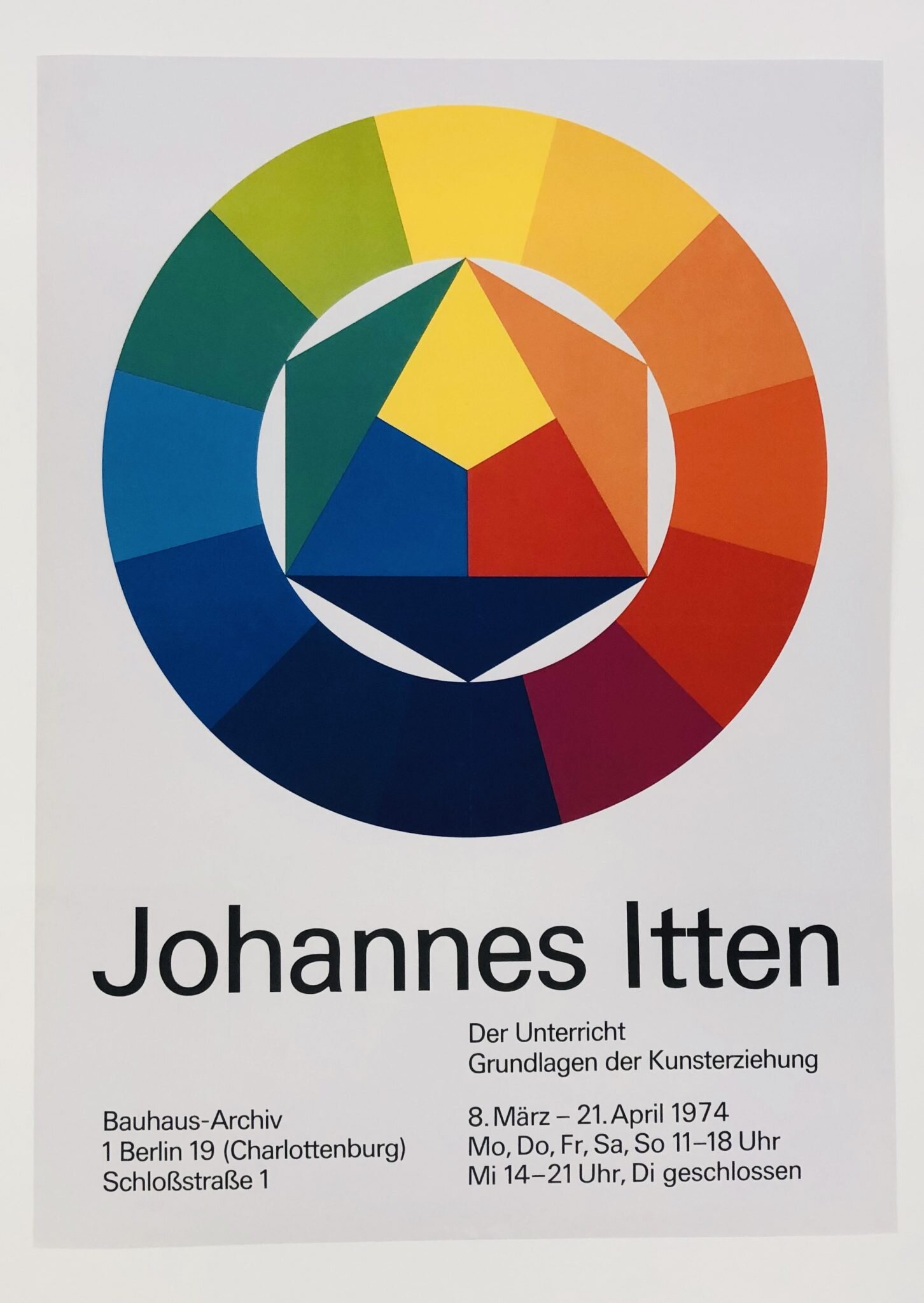
Bauhaus at 100
2019 is the centenary of Bauhaus, the legendary German design school, and a few weekends ago we decided to visit the Bauhaus Museum here in Berlin.

We were disappointed to discover that the main exhibition is closed for three years, during the 100 year celebrations, whilst the new building for the museum is constructed. There are of course events, exhibitions, and celebrations occurring throughout Germany and across the course of 2019.

In light of an increased focus and awareness on Bauhaus, Ink Blot Design has tagged the Bauhaus school as a timely graphic design trend for 2019.
While it could be argued that Bauhaus has never really gone away, 2019 marks the centenary of the founding of the legendary German design school, making it a perfect time for people to revisit the aesthetic to find fresh inspiration and new angles for design thinking.
This could mean modernist fonts, primary colour palettes and styling grounded in Brutalism.
Whatever the influence, there’s never been a better time to revisit this movement for some novel perspectives.
So Bauhaus is back. In Berlin it is being housed in a temporary venue near to Ernst Reuter Platz in Charlottenburg. While it is a much reduced exhibition it is well worth a visit if you’re in West Berlin.

Check out the other eight design trends that Stuart Crawford from Ink Blot Design believes are on trend for this year: The 9 Graphic Design Trends You Need to be Aware of in 2019.
Apply to be one of the 2019 Creative Residents at Adobe
Applications are now open, until 7 February 2019, for Adobe's Creative Resident programme.
If you're successful, you get to spend a year focused on your personal creative project of choice. You'll also gain valuable feedback from fellow creatives through sharing your work and experiences with the community.
You can learn about the Adobe Creative Residency online. Go on - I believe in you.
The importance of your own view
Jonas Downey at Basecamp talks about the importance of respecting yourself and protecting your own time and perspective as a designer.
Believe in yourself and the results of developing your skills and putting in the hard work required. Why I ignore the design industry on purpose.


