Bar Chart Race: How to Make Your Bar Charts Stand Out from the Crowd
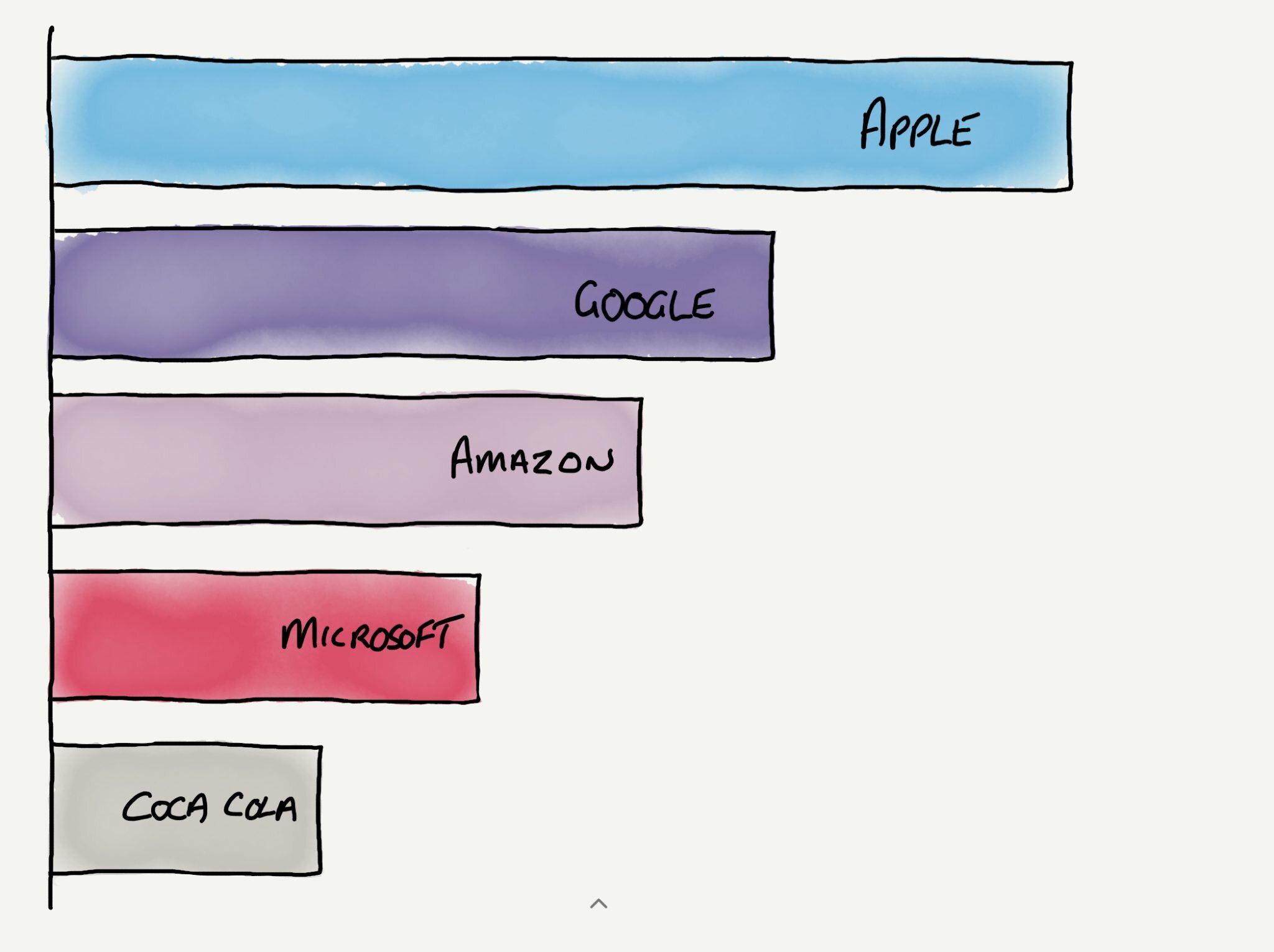
I was at the WPEngine Summit 2019 technology event in London last week and the keynote presenter was Jeremy White, Executive Editor of Wired UK. In his presentation, Jemery showed a bar chart race of brand value over time of the biggest brands in the world by value.
I've seen this chart, based on data from Interbrand, multiple times. It shows the market value of the world's biggest brands over time and displays the year in the bottom right corner. In this chart, you can watch the arrival of Google (2007) and then Apple (2011) and their movement through the list of brands.
Best Global Brands
Value in $M; color indicates sector. Data: Interbrand
What I discovered, quite by chance, is the required code and instructions on how to create your own bar chart race with your data. Mike Bostock on Observable details the structure and method to create your own version. I think that Mike has done an incredible job of making understandable the complexity that is behind the simplicity of what we see presented.
Photo by Isaac Smith on Unsplash


